Architecture with aluminium: Carlo Pierantozzi’s vision in Bologna
Carlo Pierantozzi faced the challenge of upgrading an unimaginative concrete building in a park in Bologna. To achieve this, the renowned architect realised a new structure with smooth PREFA aluminium rhomboid tiles. What he has achieved is a connection to the place in form and materiality that pleases the inhabitants of the Comune di San Lazzaro di Savena.
From Just Cavalli to Maserati
“For more than twenty years, I have been pursuing the goal of giving buildings a soul,” Carlo Pierantozzi says enthusiastically. The office name says it all, for ‘zoo’ is a reference to the Latin ‘animas’ (soul), which sounds like ‘animals’. ‘Form’ literally refers to the forming process that is essential to their work. Driven by this self-perception, zooform architecture + design create the shop interiors of renowned luxury fashion brands such Furla, Marc Jacobs or Just Cavalli. Car dealerships of Ferrari or Maserati have also made it into their portfolio. Carlo’s building commissions range between larger international projects, some of which have taken him as far as Brazil or Vietnam, and smaller ones for his hometown Bologna.
He describes his vision as “circular”: It does not run in circles but rather considers different angles and levels. Over the years, he has developed and refined a corresponding sensitivity for the situations you find yourself in as an architect, which explains the following perception: “I am not only a designer but also create and accompany architecture in all its stages of development.”
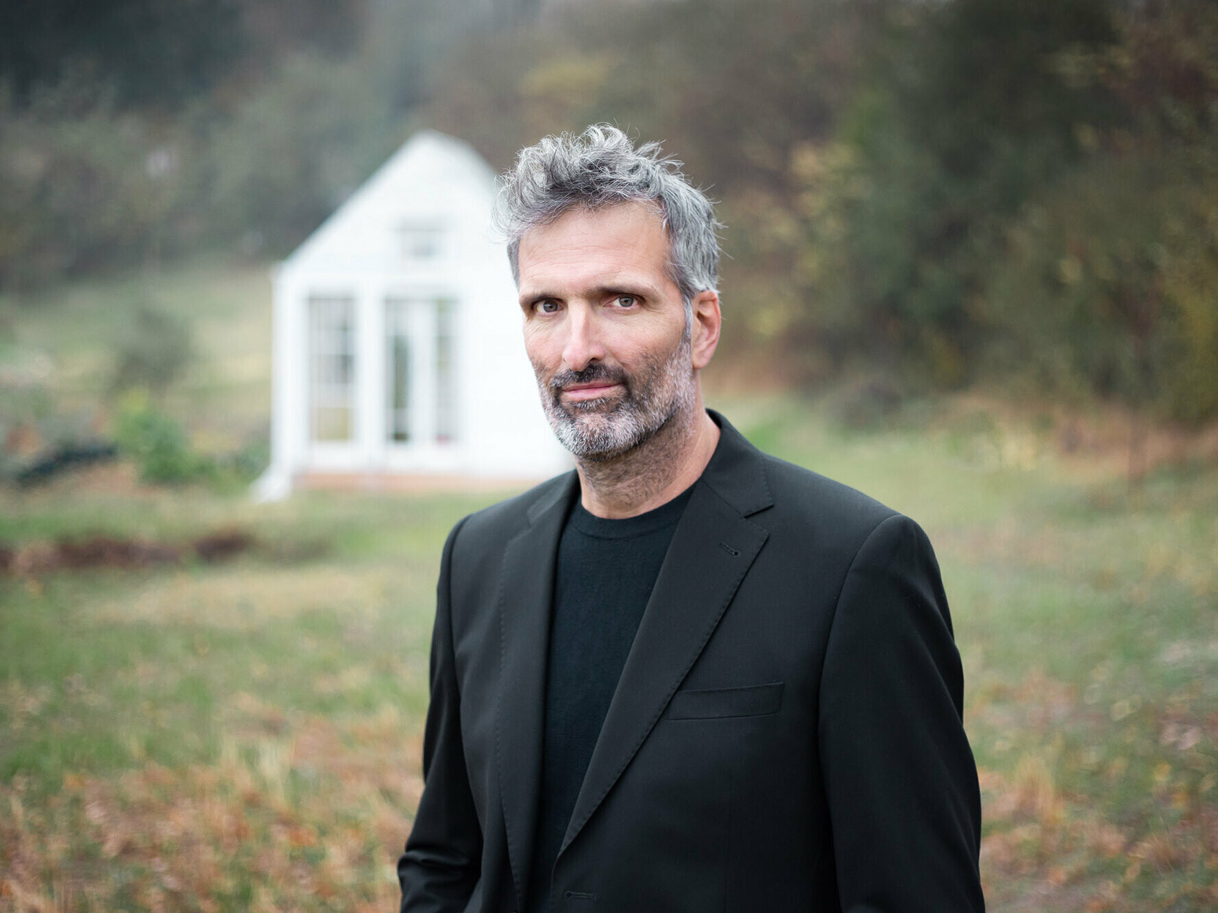
Architect Carlo Pierantozzi
Creative integration in the park
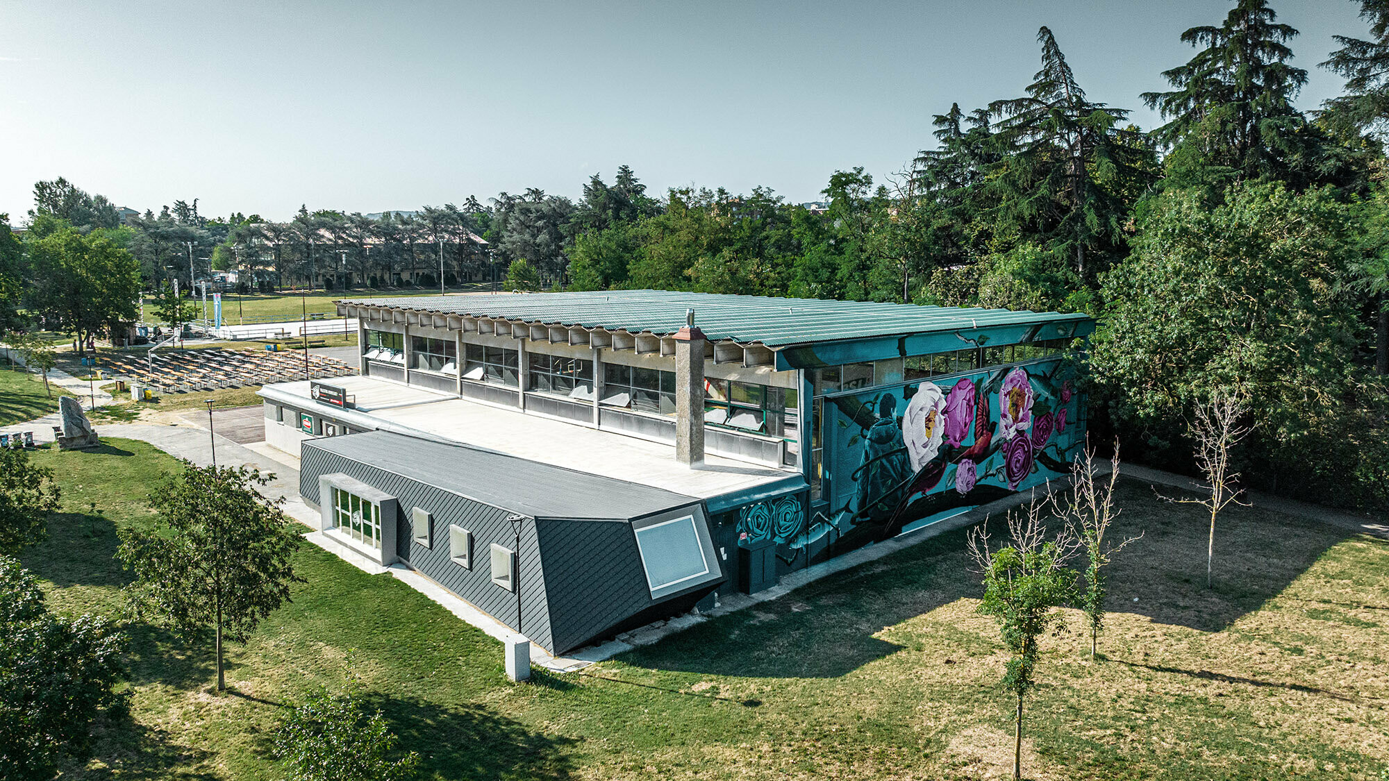
When Carlo received the enquiry for an extension of the Rodriguez gym in the Parco della Resistenza, he knew only too well what was awaiting him: a crude, brutalistic concrete building from the late sixties. It had been built without any architectural merit in the name of the noblewoman Laura Rodriguez. This situation is ideal to describe how zooform architecture + design work: “We would never think buildings only in terms of their function and place a rectangular concrete block in the middle of a park, as was the case here. But since we had to work with the given situation, we asked ourselves: How can we create architecture that goes further with what is already there? How can we establish a connection between this new architecture and the park?” After all, incorporating the surroundings into your design is one of the most important aspects, says Carlo.
United inside, different on the outside
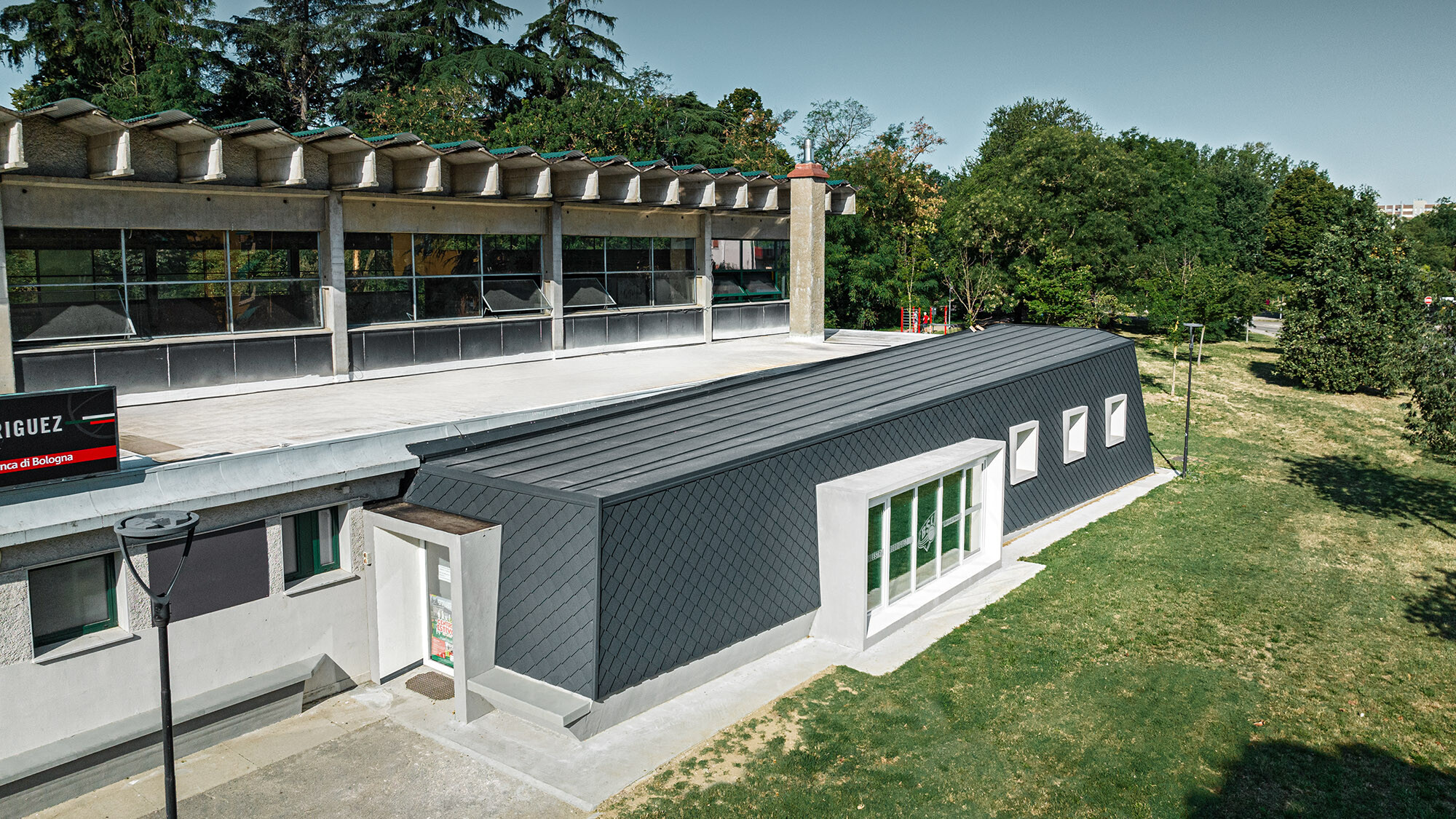
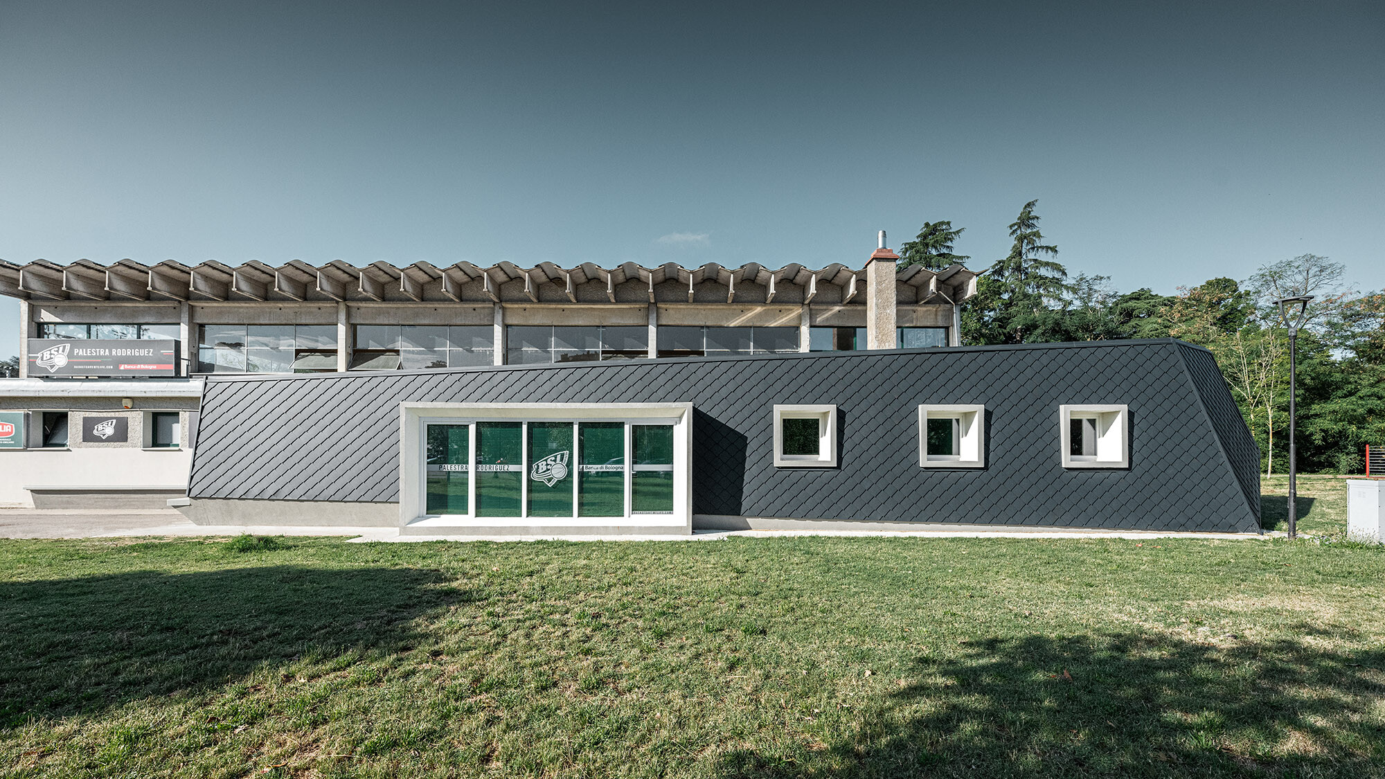
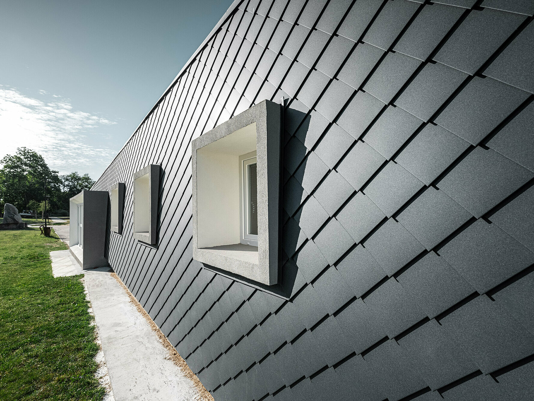
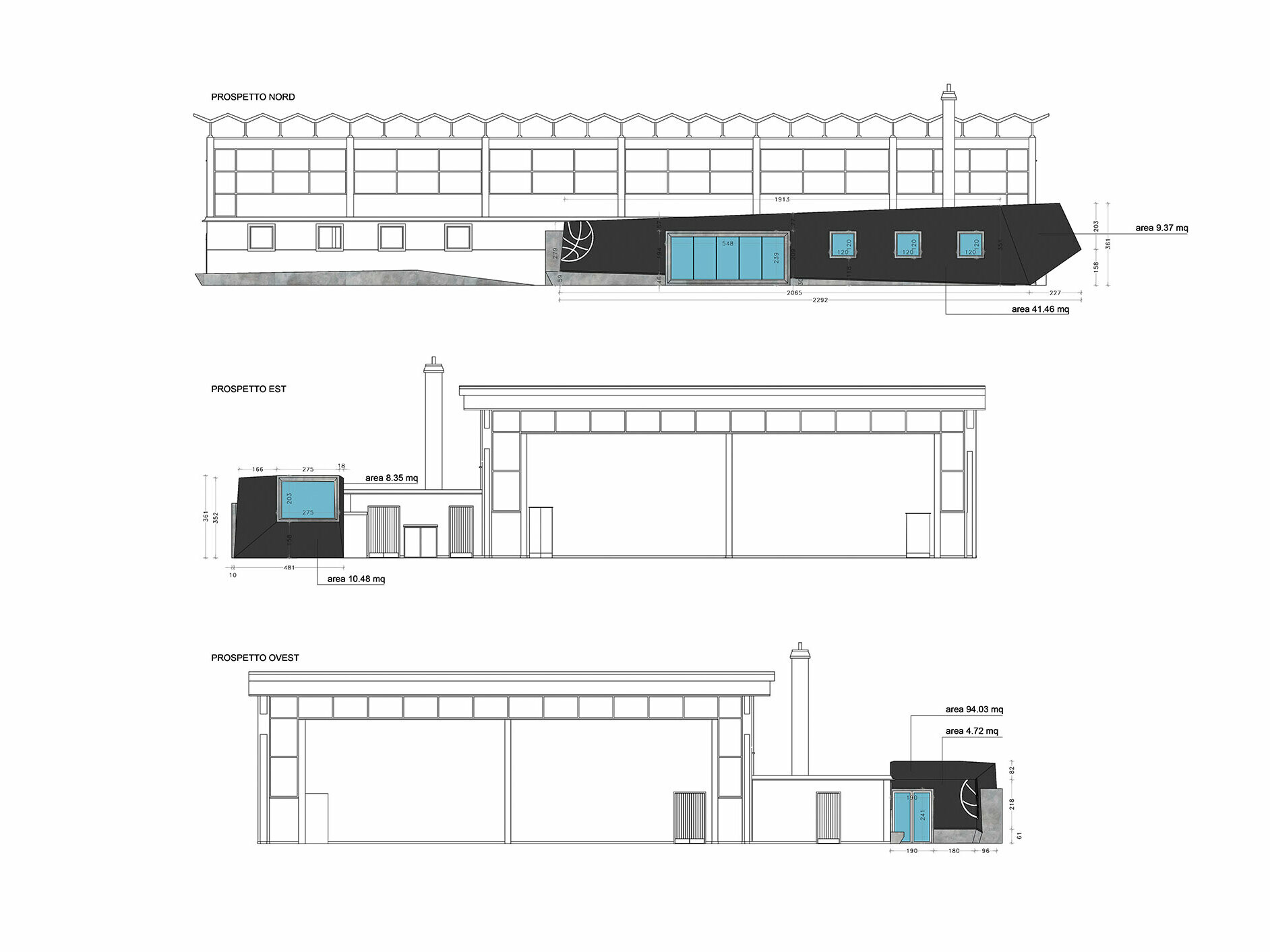
The designer saw the solution in an addition that is both functional and aesthetic. On the outside, it is perceived as a separate part, as an elongated structure placed in front of the gym with an entirely new design language. Inside, it is connected with the gym via a fitness room, multi-purpose room, storage room and a bathroom. With a little bit of imagination, its shape reminds of a fish; the head area with the rectangular window faces upward while the rest of the body is flat on the ground. This image is intensified by the appearance of a fish skin, created by Fabrizio Cassanelli with the small rhomboid façade tile 20 × 20 in anthracite. Carlo appreciates these tiles because they combine sustainability and aesthetics. They make it possible for the building to reference the river flowing through the park.
AH: “In the architecture industry, the term ‘sustainability’ is sometimes used as an empty phrase, in a completely wrong way. What are your thoughts on this?”
CP: “What particularly bothers us is when sustainability is not ‘real’. Many pretend to build ‘sustainably’ and treat it like a fad – just think of greenwashing. The ethical component is often forgotten in the process. When we were choosing the materials for the Rodriguez gym, we made actual ethical decisions: Which materials are we going to use? Who are we going to source them from? What are they going to look like in the future? Can they be completely dismantled and reused when they have reached the end of their service life? I’m very interested in revitalising dilapidated buildings. PREFA proves to the an excellent building material for this purpose because of its good recyclability. If houses are built in such a way that they have to be torn down again after twenty or thirty years, it makes me think.”
Experiencing built art
Can architecture have a soul? And does it even exist without its viewers? When confronted with questions like these, Carlo warns: “With our architecture, we expose those viewing it to a unique art. So we should use it very carefully.” He continues that buildings do not automatically become works of art by merely existing, but only when one sees and experiences them in reality.
This also applies to the gymnasium after its extension, which is embedded in the park alongside a tennis court, a basketball court, a prehistoric museum, an open-air park and a kindergarten. Standing before it, one can see how what was newly created and previous attempts to make the hall blend in more with the urban fabric of Bologna complement each other. The graffiti art on the concrete façade was created by Fabieke, a Bologna-based artist with whom the municipality of San Lazzaro collaborates often. If you take a closer look at the façade art of the existing structure, you can also discover a connection to the nearby river: in its lower left corner, where a fish is swimming past two blue-green rose heads.
Palestra Rodriguez - Details
Country: |
Italy |
Object, location: |
gymnasium, Bologna |
Category: |
extension |
Architecture: |
zooform architecture + design |
Installer |
Fabrizio Cassanelli |
PREFA object consultant: |
Alessandro Valentino |
Material: |
|
Colour: |
P.10 anthracite |
Further information:
Text: PREFARENZEN team
Plan: zooform architecture + design
Portrait: Amy Leigh Cook
Photos: Giacomo Podetti
