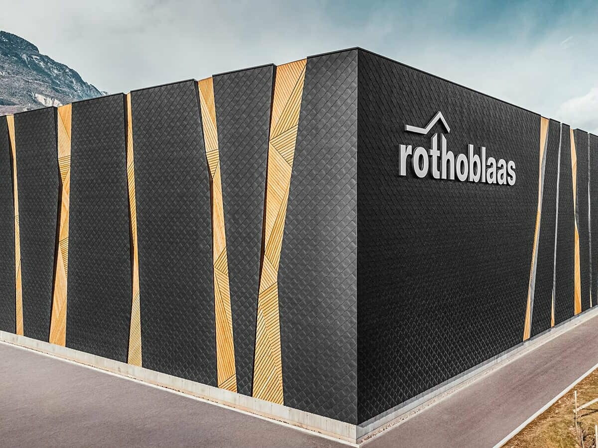
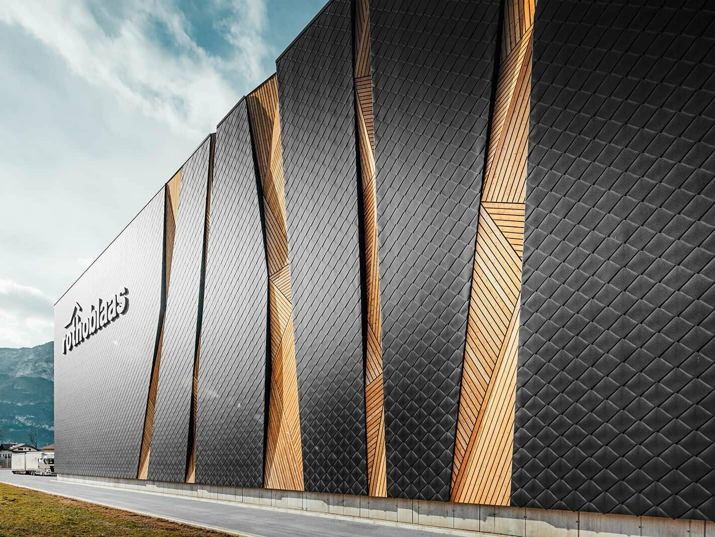
Open envelope? In Kurtatsch on the South Tyrolean Wine Route (IT), you can find an impressive, matt-black industrial building by the Adige with an architecture that reveals what is inside and relates to its surroundings. This also has something to do with targeted incisions in the façade.
Points of contact
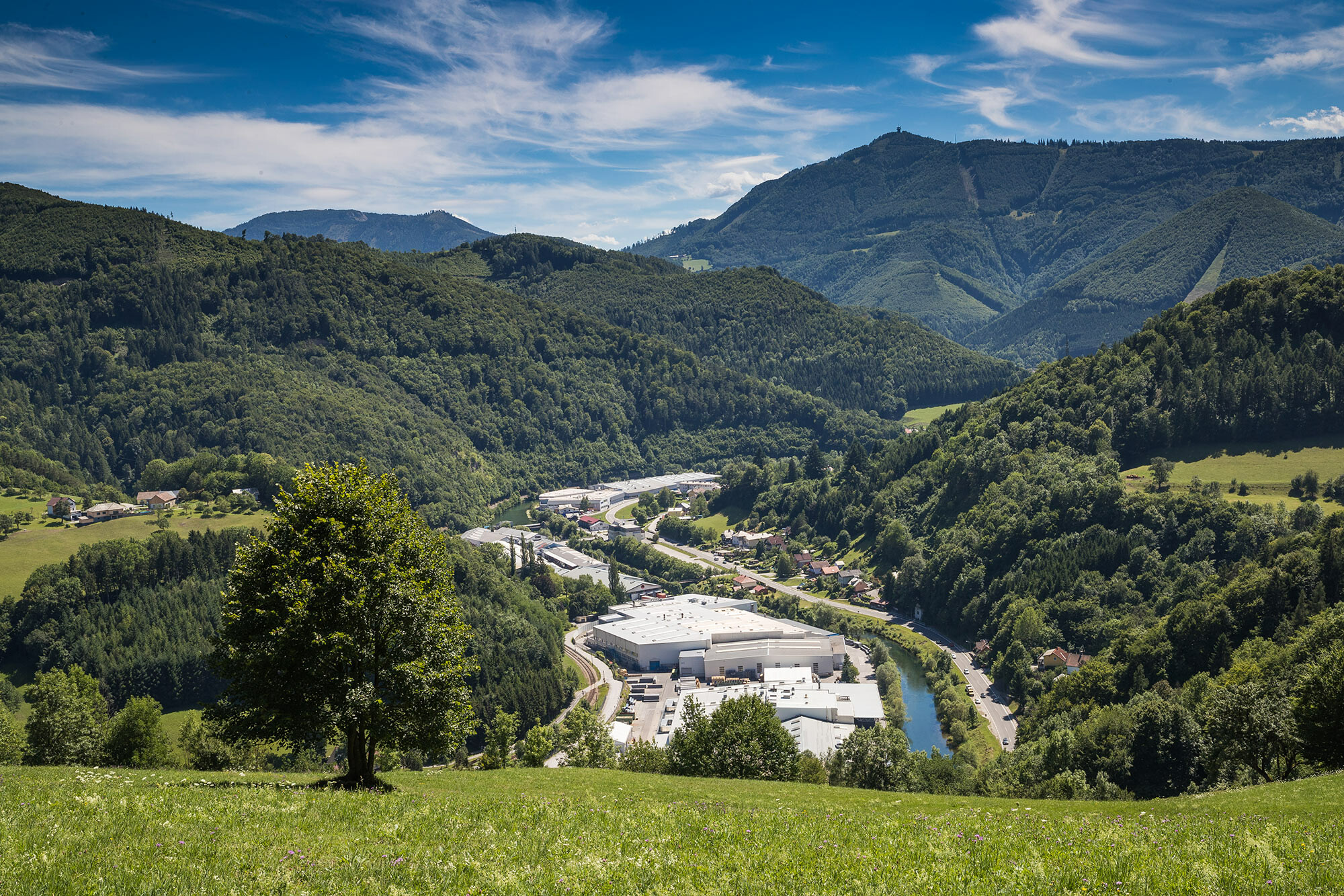
We met PREFARENZEN architect Lukas Burgauner in an industrial area surrounded by vinyards to find out about the central high-bay warehouse he planned for Rothoblaas – an internationally successful company that primarily specialises in the development and production of innovative, practice-oriented joining systems, tools and materials for timber engineering. The fact that it was expanded will facilitate and speed up the work of carpenters on construction sites such as that of the company’s own 23 m high and fully automated high-bay warehouse with 22,000 pallet spaces.
It was not the first point of contact between Mr. Burgauner and the owner Robert Blaas: The South Tyrolean architect has been working for the company ever since this location was constructed in 2003 and has accompanied all the conversions and extensions of office and storage areas that have become necessary on account of the expansion. “We are currently expanding in the former high-rack warehouse, where we are integrating a storey ceiling on an area of 1400 m² for an additional 80 office workplaces,” he tells us enthusiastically.
Sustainable – of course
In addition to a stylish design that embodies the company’s identity, the topic of sustainability was also central to the architect and the client. “Over the next few years, our headquarters should become CO₂-neutral, this concerns for example heat pumps, solar energy and photovoltaics,” says CEO Robert Blaas. He is responsible for the company’s marketing activities and is also in charge of Africa and the Middle East. “We are present in 60 countries with 25 subsidiaries and focus on quick decision-making and short distances. For our expansion here in Kurtatsch, we hired installers who belong to our customer base.” With its longevity, the recyclable aluminium also fits in with the environmentally friendly company philosophy.
Beyond function
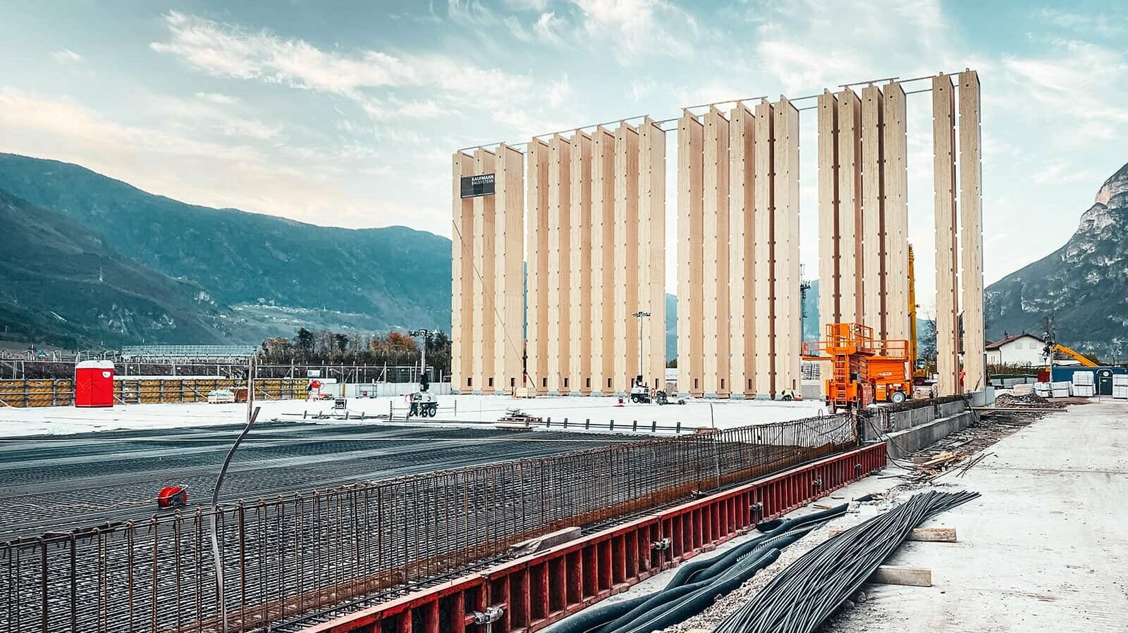
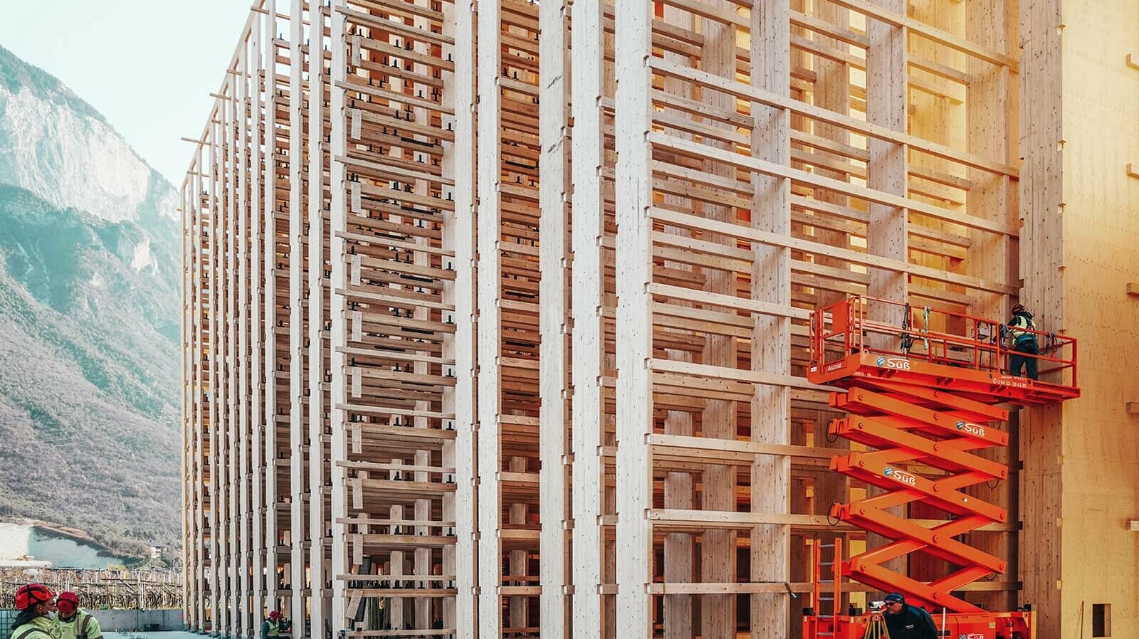
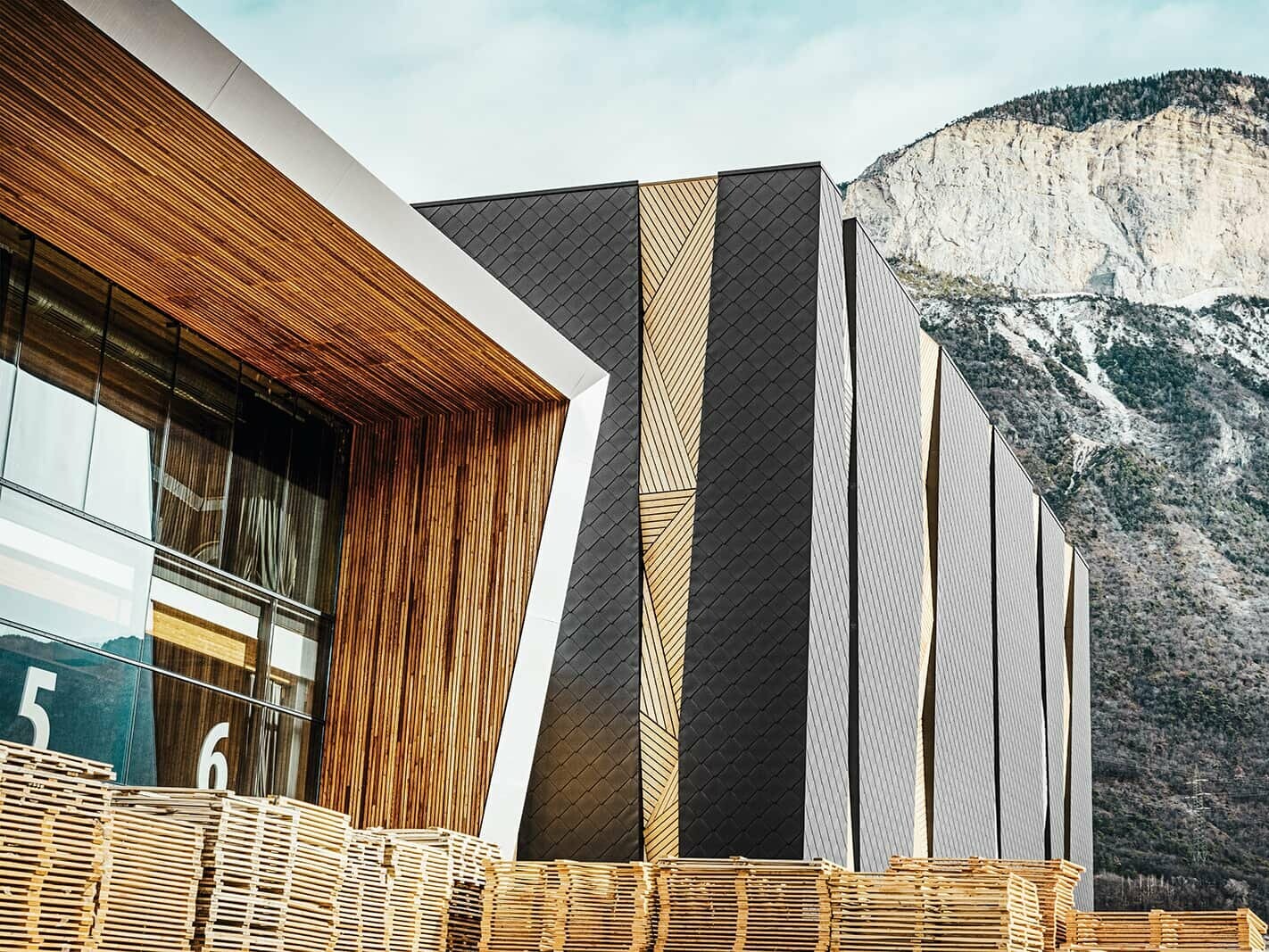
The point was reached where the building – which serves as the central warehouse for all subsidiaries – needed to be expanded so it would have a larger capacity for pallet spaces. From a planning perspective, purpose and use were clearly in the foreground here, which Robert Blaas corroborates. Yet with the open, rhomboid aluminium envelope and the wooden façade with slight recesses, Lukas Burgauner shows that functional building does not automatically have to exclude exciting, eye-catching architecture. A special feature: Since the company is active in timber construction, one of the requirements on the client’s side was that the high-bay warehouse also needed to be built exclusively with wood. The wooden façade, which is also partially visible on the outside in addition to the aluminium envelope, refers to the solutions for timber construction stored inside. You could say that the material says it all.
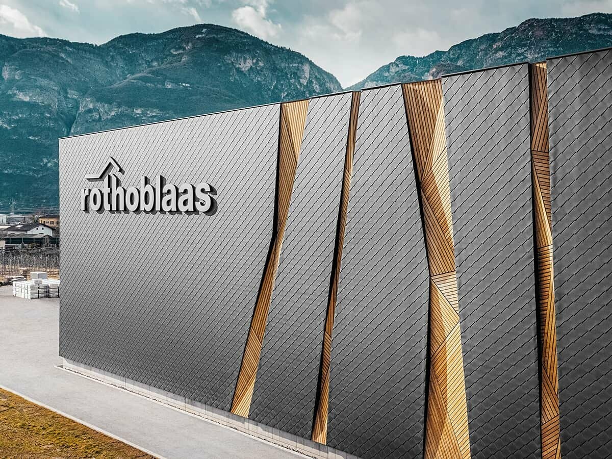
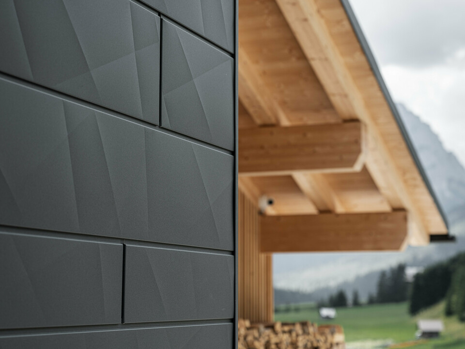
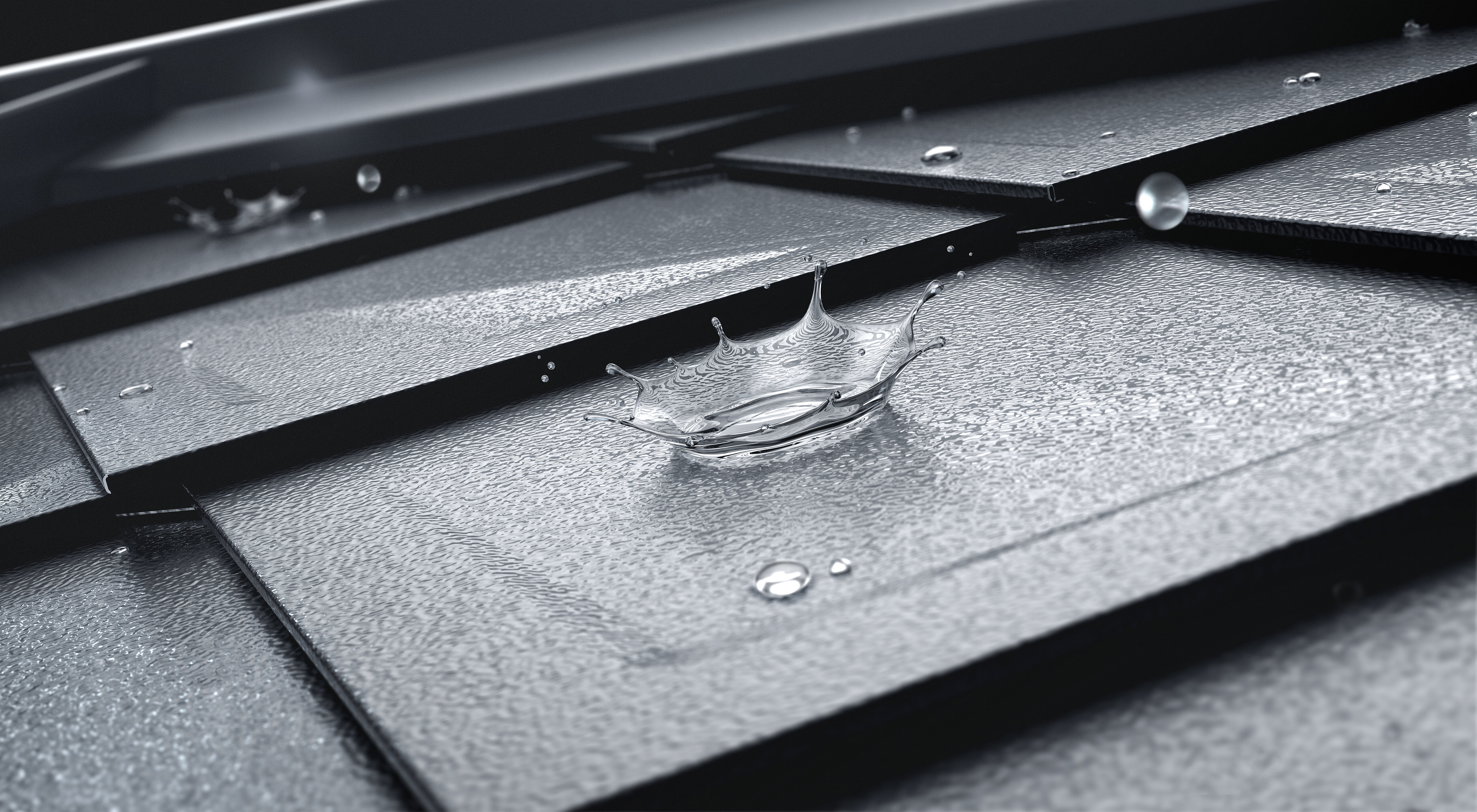
However, due to the resulting weathering, it would have been very expensive in the long run to realise the entire building envelope in wood. This was the reason why the architect found an ideal façade solution in the rhomboid façade tile by PREFA: “We used PREFA here because it fits very well into our design concept. What is more, the material is ideally suited for industrial façades thanks to its quick mounting and the possibility of laying it on large surfaces,” says Burgauner.
Idea in the mountain
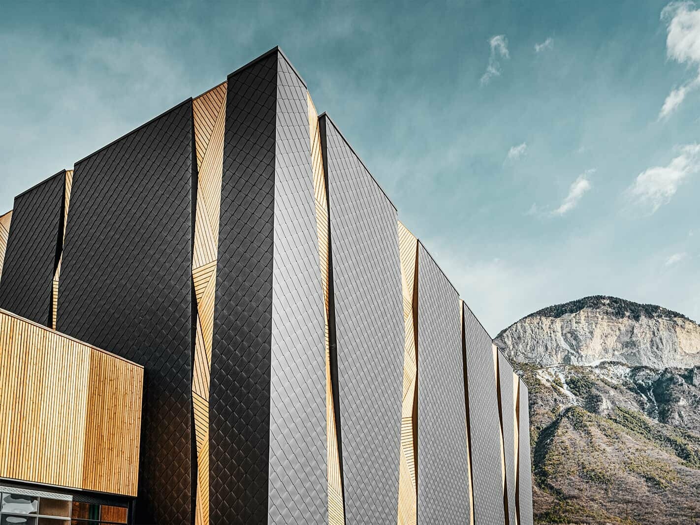
When you look at the approx. 5000 m² large façade, you automatically marvel at proportions and how the surrounding mountain range influenced its appearance. The original building volume of 72,000 m³ was expanded by 75,000 m³ and thus practically doubled. This volume is loosened up by the façade’s special design, which is rhythmised with irregular openings.
The “slits” were also chosen because they were already used in the façade of the second and third extensions of the company’s headquarters. They seemingly offer a ‘glimpse inside’ and were inspired by nature: “The cirque you can see in the background served as the initial spark for this design idea,” Burgauner explains. And indeed, if you directly compare the company headquarters with the surrounding mountain range to the east and west, you can find colour overlaps: the black of the aluminium in the dark forest, the structured wooden surface in the rock. Apparently, it is in the architect’s nature to refer to the surrounding mountain landscape – which you can also see in his valley station of the Seiser Alm cable car depicted on the cover of the PREFARENZEN book 2017.
A lot is happening …
“In South Tyrol, architecture has changed drastically over the pasts two decades: away from the playful mountaineering architecture of the nineties towards a contemporary design language that is enabled by a new generation of architects and new materials.” Lukas Burgauner’s office chiefly focuses on the conversion and expansion of corporate buildings. The team is currently planning two mobility centres, one in Brixen, one in Bruneck, as well as the logistics building of a beverage wholesaler. The architect welcomes it that some companies have developed a greater sensibility for architecture: “Many of them have come to realise that expressive buildings with recognition value can convey their corporate identity, and in a sustainable manner, too. For contemporary architecture also reflects the company itself.”
Rothoblaas expansion - details
Country: |
Italy |
Object, location: |
industrial building, Kurtatsch |
Category: |
expansion |
Architecture: |
Lukas Burgauner |
Installer: |
Trimont GmbH and Festi Lattonerie S.r.l. |
Material: |
|
Colour: |
P.10 black |
Further information
- Text & interview: Anneliese Heinisch
- Photos: © Croce & Wir
- Construction site photos: © Lukas Burgauner
